
So you have a great looking new WordPress site design, but are not quite sure what image size you should be uploading to WordPress. Maybe you have a full-width background image or hero image. What size should the background image be? 1000px, 2000px, 3000 px or higher? With today’s multi format, multi device world, deciding what image size you need to upload to your new WordPress site can be very confusing. Even among the professionals.
Warning!!
This is a long blog. The good stuff is at the bottom, but skipping the middle will hamper your understanding of image sizing!
Back “in the day” — before “device proliferation” life for the web developer was very simple. Every website was designed for desktop only and generally for a fixed screen resolution of 800 x 600 px. Yes I actually remember that!
But today, there are literally hundreds of different screen sizes and resolutions.
Definition
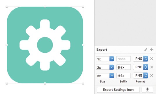
Firstly let’s make it clear that I am talking about bitmap images here. Not vector graphics. So we’re talking jpg and png. I am also focusing on WordPress, but this info equaly applies for any website.
Point vs Pixels
Lets start by talking about points and pixels, the building blocks of all digital and print images.
There is much confusion around this topic. Especially in recent years when Apple changed their reference in screen sizes from pixels to points.
A Pixel is = a single group of coloured dots on a screen
A vital point to remember about pixels is they do NOT have a uniform size.
That’s why we measure DPI/PPI (Dots per Inch or Pixels per Inch)
Smaller = Better
Why does an iPhone 7 Plus have 401 PPI, whereas a 60inch Full HD Samsung TV has a PPI of 37? Answer — the pixels on the iPhone are much much smaller.
Furthermore, they will continue to get smaller as manufacturers push the limits of engineering to bring higher resolution screens.
A smaller pixel means you can squeeze more detail into the same physical space, this gives more clarity to images and text.
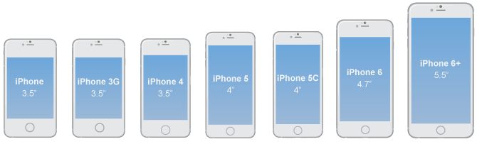
The original iPhone screen was 3.5inches in diagonal screen size and had 320 pixels across and 480 down — giving an PPI of 163.
When Apple and other manufactures introduced the Retina type screens — which are simply screens with smaller size pixels — they had a problem.
Apple’s Retina screen has a minimum PPI of 326. Which is double the original PPI.
So if you had designed a WordPress website (or any image for that matter) to display on the iPhone 3, your maximum image width only needed to be 320 pixels (full width of the screen). On a Retina screen an image 320 wide will only be half width on the screen. That’s not good for images, it’s even worse if you are designing a UI interface like a button as they would become too small to be usable.
Points + Density Independent Pixels
So Apple borrowed a term from the world of print, “Points”. Taking 163 PPI (original iPhone PPI) as their benchmark, they would give all future screens a multiplier ratio so the photos/graphics took up the same physical space regardless of the screen density.
This makes sense. Points come from the physical world of printing. A screen is a digital form of print and your images and UI need to be readable and crisp. Which means they must be an appropriate physical size.
This is why Points are more related to physical size than pixels.
Think of it this way.
The red line below represent the original iPhone pixel. You can see that on the more modern iPhones, that pixel would look incredibly small. The blue line is the size of the Apple Point (pt). Or in the Android world, this is called the Density Independent Pixel (dp). You can see that as long you apply the correct multiplier factor, the Apple point or dp remains the same physical size.

To help explain further, here are some more iPhone stats…
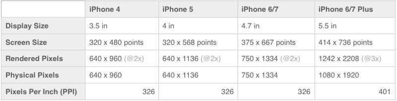
A full size jpg image on the iPhone 4, for example a full width background image on WordPress, would be 640 pixels across, on the iPhone 7 plus, that image would need to be 1080 across to take up the same physical space on the phone
So we get a formula:
Points X Ratio = PixelsOR
Pixels / Ratio = Points
(You can see that the actual size of the 6 plus is slightly less than x3, but the 3 is used for simplicity.)
Multiplier Basics
So what does this mean for you?
When it comes to designing your new WordPress website, WooCommerce store or blog, you should…
- Not worry about the end user screen resolution.
- Design in points 1pt = 1 px
- Do your calculations at the end (Sketch will do this for you automatically)
So to recap…
Keep the design focused on ratio — not resolution
When it comes to designing your WordPress website, forget about screen resolutions and focus on the overall aesthetics of the design.
Design in Points
By that I mean assume for simplicity that 1 pt = 1 pixel, (multiplier of x1). So if you are designing for a iPhone 6 homepage on Sketch, you would start with a layout of 375 x 667 px. So you are assuming that 1px = 1 pt. You will output the correct pixel size at the end.
Apply your multiplier(ratio) to your final output
So if you design in pt using iPhone 6 as above, you would apply x2 multiplier to your photos and icons to get the pixel size required for a clear display on the iPhone 6.
What about Tablet and Desktops?
With tablet and desktop it is the exact same principle. Design in x 1, then apply your multiplier at the end.
For instance, the iPad benchmark is the non-retina iPad 1 and 2.

Multiplier factors for the Ipad
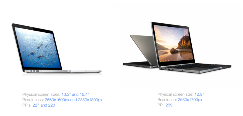
When we come to desktops, the benchmark for Apple is the old Macbook Pro with a resolution of 1440 x 900. The multiplier ratio for the retina screen then becomes x2 to get 20 2880 x 1800px (latest Macbook Pro retina screen) (note I’m not including the new 4K iMac screen here).
3 X The work
The truth is quality WordPress web design is more complicate now than in years past.
A responsive WordPress theme, is NOT enough.
You should be designing your WordPress website, specifically for mobile, tablet and desktop. Plus for each of these you may wish to output various image sizes — especially for your mobile audience.
It’s more work, but that’s what good design is all about — consideration of the end user.
Why not let the browser resize?
Chrome and Safari will happily resize your images if you prefer not to do the work in advance.
The problem?
First, a little note on jpg. Once an image has been exported as jpg — it cannot be increased in size without losing clarity.
So one of two things will happen. Either your images were too small and the browser has applied the multiplier ratios on your behalf, which means they are now blurry.
Or you offered incredibly large images to everyone. So now your website loads incredibly sloooowly.
The Trade off between image size and speed

The reason we offer different images sizes to different devices is not just connected to clarity. It is also about speed.
Obviously the larger the image, the larger the file size.
Speed is incredibly important when it comes to the success of your WordPress website. Despite being a fan of the WordPress CMS I would also add that one of the disadvantages of WordPress is a bloated infrastructure, so you want to optimize speed at every given opportunity.
It is even more important when it comes to mobile websites. With 80% of users using a smartphone to access the internet — you do NOT want to piss off your mobile audience by slowing down your website, while their mobile internet downloads a 2880 px wide image that is designed for desktop
So we try to offer an image that is as small as possible, whilst also being as large as necessary.
That means you need to know what device they are using in the first place.
Using CSS @media queries
To ensure that all this design effort is worth it and the user is offered the best image size for their device, you will need to use some css trickery.
The best way to offer different images and content to different devices is to use @media queries in CSS.
Media queries in CSS basically allow you to create “screen breaks”. In turn this not only enables you to offer different image sizes, it also enables you to offer different styles and layouts to various devices.
When it comes to using CSS there is so much we could talk about that would take us off topic.
Mobile First
But as a start I would recommend reading some info on Mobile First CSS
Mobile first design, in essence says you start with the small screen and design up. As one designer says…
Start with the small screen first, then expand until it looks like shit. Time for a breakpoint! –Stephen Hay
I really don’t want to get off topic here. But one VERY IMPORTANT note about @media queries.
Browsers return the POINT VALUE OF THE DEVICE — NOT the actual PIXEL VALUE
This is important if you wish to offer different image size to higher resolution screens. So your website will still think an iPhone 6 should fit the criteria below…
@media only screen and (max-width: 500px)
Even though it actually has 750 physical pixels across. Do you see what it’s doing? Applying the point value (375) or in effect reversing the multiplier ratio effect.
So working with px in css will tell you if they are using a mobile, but it will not tell you if the user is using a high resolution screen. For that we need…
Device pixel ratio
CSS will never know the user is using a retina or high res screen unless we check the “device-pixel-ratio” or "min-resolution" of the screen
What is the device-pixel-ratio ?
It is simply the multiplier ratio we have been discussing, that gets you from pt to px, or from low res px to high res image.
We need to check this in order to discover the type of the screen being used.
#element { background-image: url('image1.jpg'); }

@media only screen and (min-device-pixel-ratio: 2) {
    #element { background-image: url('image2.jpg'); }
}

@media only screen and (min-device-pixel-ratio: 3) {
    #element { background-image: url('image3.jpg'); }
}
So for example, using the above code would offer a different image depending on the resolution of the users screen.
You can check the ratio of the screen you are using to read this using this neat site:
What’s my device ratio?
In practice and for the sake of convenience you may want to offer the one image size to all mobile users. Unless you are operating in a country or user group where internet speed is an issue.
But enough of CSS, otherwise this blog will never end.
Finally The Good Stuff
Let’s try and pull all of that together. All of the above was just setting the scene for our awesome cheat sheet 🙂
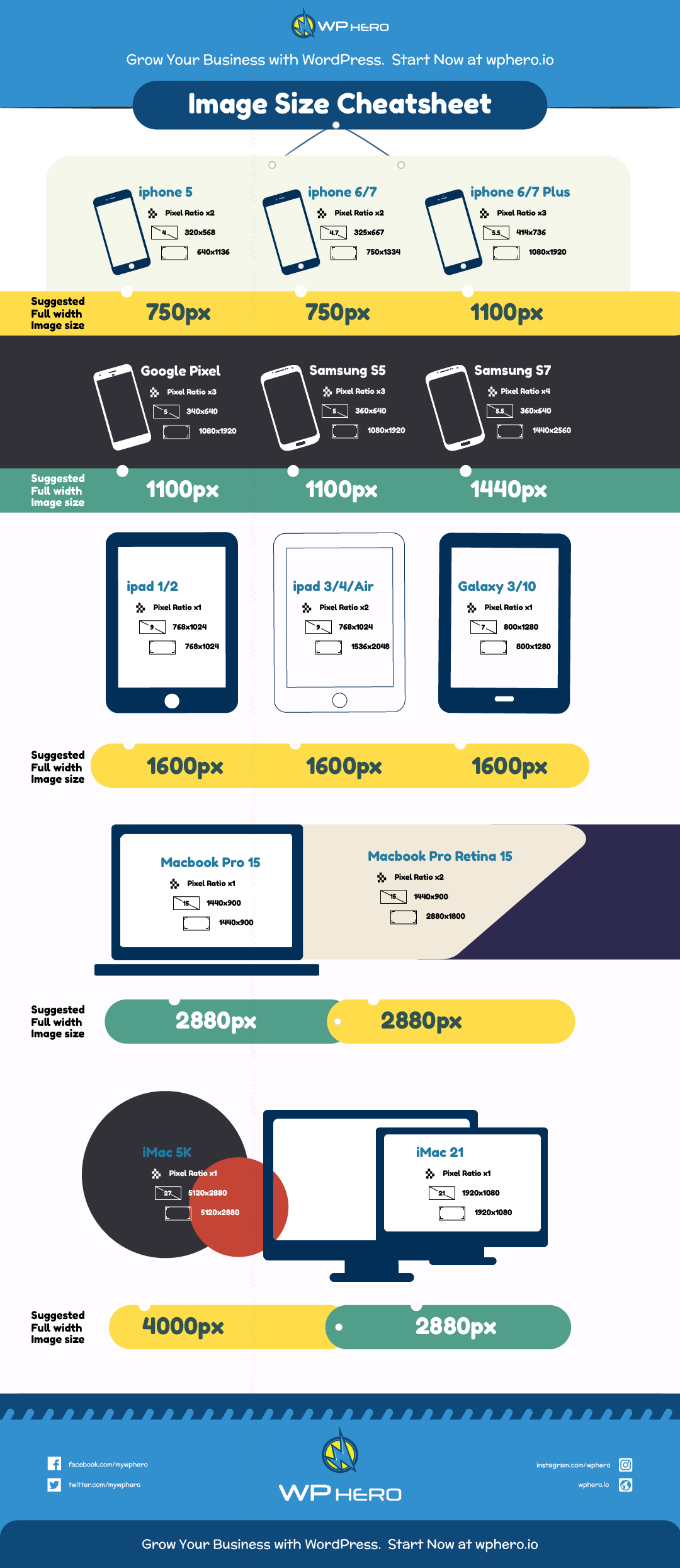
One of the most common questions we get at WP Hero when redesigning or updating WordPress websites with our awesome WordPress support service is “What size of images should I send you for my WordPress website”. Most of the time the question is related to full-width hero images.
So our cheat sheet below lists our recommended width for images. Height will depend on the website design.
Share This Post